PPG’s 2021 Color of the Year Is More Than You Ever Imagined
The wait for PPG’s 2021 Color of the Year is over. Last year, it was the rich, deep blue, Chinese Porcelain. The year before that, the luxurious dark green Night Watch. But in 2021, PPG goes beyond expectations and releases an entire color palette: the “Be Well” Palette of the Year.
In an era where normal isn’t normal any longer, and our mental and physical wellbeing are more important than ever, these optimistic, soothing, and nostalgic colors offer simple comforts to a burned-out world.
“With the world sheltering-in-place for the better half of the year, we have begun to crave human connection and are embracing simple activities, including walking, hiking, baking, and gardening,” said Dee Schlotter, PPG senior color marketing manager, architectural and industrial coatings. “This organic but hopeful palette represents what we have been longing for after decades of over-stimulation and over-consumption – simplicity and restfulness.”
See The 2021 “Be Well” Palette of the Year
The trio of colors celebrates beauty of all kinds.
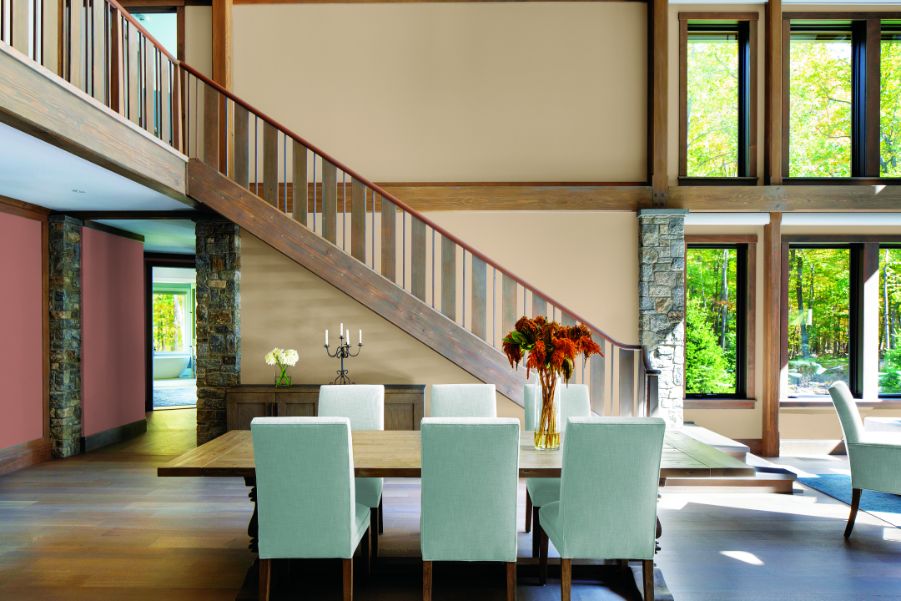
Transcend
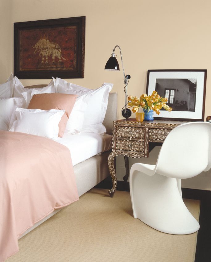
Transcend, a mid-tone oatmeal hue draws on earthy influences. It’s the antidote to the era of cool gray, a cozy neutral that has the feeling of a warm latte on an autumn morning.
Big Cypress
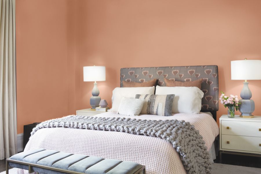
Big Cypress, a ginger with persimmon undertones, is like a hug for your home.
Misty Aqua
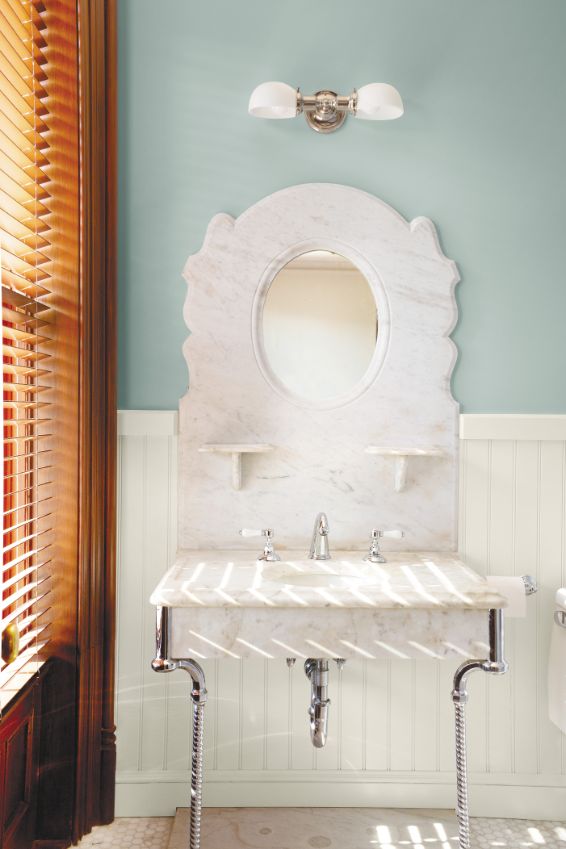
Misty Aqua, a watercolor cerulean blue, offers a fresh balance to the warm, earthy tones.
Use this blend according to the 60-30-10 design rule, where 60 percent of the room is the dominant color, 30 percent is the secondary, and 10 percent are accents.
This nurturing palette works together to make space for comfort, support, relief, and joy.
In addition to the Be Well palette, PPG color experts identified two more color stories that will resonate in 2021.
Be True: Anchoring Reality
This palette celebrates authenticity and connection through the artisan’s touch. It renews traditional know-how, anchoring vintage-inspired colors with recycled and contemporary touches.
The palette mixes organic and heritage influences with warm, earthy tones and rich, jewel box hues. Enchanting Eggplant, a rich maroon with chocolate undertones, grounds the palette alongside Gargoyle, a glass bottle green, and Transcend.
Be Wild: Activating Optimism
A mood-boosting color combo, these hues celebrate individuality and the reclamation of power. Playful, expressive, and creative, PPG’s Transcend brings an earthy element to French Lilac, an unexpected periwinkle, and Mediterranean Blue, a marine aqua-blue with a deep-water undertone.
“When the world experiences events that cause unrest, anxiety, and grief, we tend to naturally gravitate toward comforting colors that allow us to create a personal retreat from the world,” said Schlotter. “These comfort colors are similar to comfort foods – both offering a certain sense of familiarity and normalcy when facing the unknown.”