7 Beautiful Home Library Paint Colors

Home libraries are often peaceful retreats—but that doesn’t mean the color palette has to be predictable. You can create a reading area in your home office that reflects your personality and draws color from your home decor, from the walls to your book collection. Choosing the right library colors can transform a space from purely functional to deeply inspiring.

When selecting home library paint colors, think about the kind of ambiance you want to create. Lighter colors like soft whites and muted grays will lend a sense of openness and calm, ideal for minimalists or those integrating a reading space into a shared living room. Meanwhile, darker tones like rich blues, blacks, or forest greens offer a cozy, moody vibe — a perfect match for traditional libraries filled with leather-bound volumes and antique furniture.

Your choice of library wall colors can influence everything from concentration to relaxation. Whether you’re building a full-scale reading room or carving out a quiet corner in a busy home, paint is one of the most important tools to help define that space.

Below are 7 fresh ideas for home library paint colors to inspire your next reading retreat.

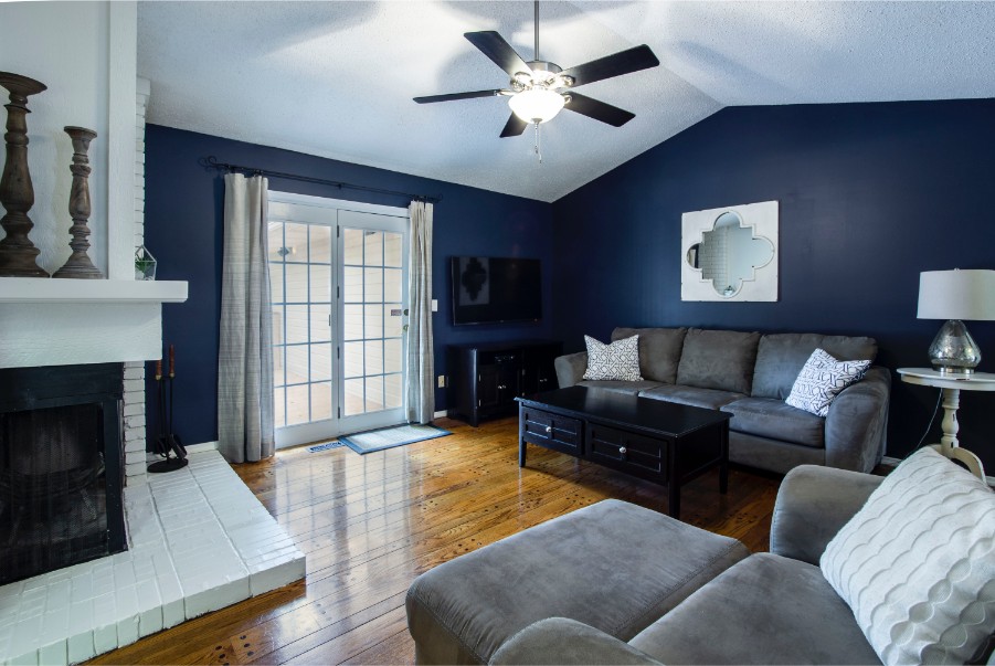
dark blue accent walls

1. Moody and Sophisticated: Deep Blue or Charcoal Walls

If you love a sophisticated, elegant space, consider black walls like Sherwin-Williams Inkwell. This deep hue gives your home library the feel of a men’s club, both upscale and welcoming. To offset the dark walls and show off the beauty of your room’s architectural bones, paint the ceiling, crown molding, trim and built-in shelves an off-white like Sherwin-Williams Alabaster.

For more insight on this trending hue, check out why black paint is making a major comeback in interior design.

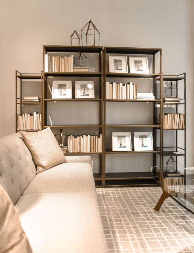
bookshelves beige living room

2. Modern Drama: Painted Built-In Bookshelves

Continue the Pinterest-worthy black trend by painting your built-in bookcase a bold, dramatic shade like Sherwin-Williams Iron Ore to make it stand out from the surrounding walls. Black paint makes built-ins visually recede, drawing the eye to the books and furnishings — a wonderful idea if you want to spotlight decor details or create a gallery effect.

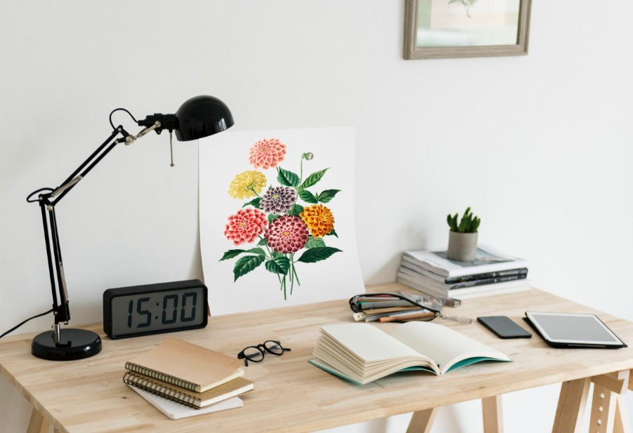
home office wood desk

3. Glossy Monochrome: Teal All Over

This small library is big on style with its glossy teal walls, ceiling, and shelves. When you paint everything the same color it creates a unified visual flow, allowing the eye to travel the space unimpeded. A monochromatic color scheme makes a small room look bigger, even if the paint is darker. Stack coffee table books horizontally rather than vertically, then hang small accessories from the shelves (a pretty framed picture, an herb wreath) to personalize the space.
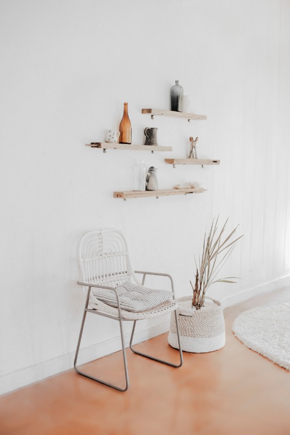
Try a shade like Sherwin-Williams Blue Mosque for a bold, rich feel that inspires creativity and concentration.

white walls floating shelves

4. Light and Minimalist: White Walls and Floating Shelves

Another minimalist design idea is to set aside some room for a library in your living room. We love the idea of floating shelves, some light window treatments, a modern table lamp, and a soft white paint backdrop to create the ultimate reading corner that doesn’t take up a lot of space.
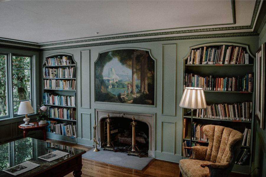
Use a clean, inviting color like Sherwin-Williams Greek Villa to brighten up the space and keep it flexible. Looking for more inspiration? Our post on cozy minimalism is full of tips for achieving balance and style in even the simplest settings.

forest green home library

5. Forest Green for Warmth and Tradition

Rich, deep green is such a soothing color, perfect for the quiet environs of a home library. Try painting walls and shelves the same shade, such as Sherwin-Williams Pewter Green, then do the rest of the room’s trim and the ceilings in white.

Use this trick if your shelves aren’t built in but you want them to look like they are. Pairing green with cheeky leopard-print accessories or brass lighting can keep the look fresh and contemporary while honoring the room’s traditional roots.

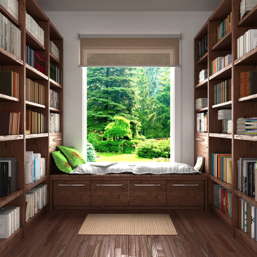
reading nook with bookshelves

6. Bright and Clean: Wood Tones with Light Paint

For fans of modern and contemporary spaces, try white paint and a light floor, then add natural wood to warm it all up. Another way to warm it up? Built-in shelf lights or other wall lighting. They’re a great way to highlight favorite books and accessories.

Try a versatile neutral like Sherwin-Williams Incredible White for a hint of softness and warmth. If wiring isn’t an option because you live in an apartment, just use stick-on, battery-powered puck lights.
bright light windows living room

7. Book Tower Aesthetic: Floor-Styled Libraries

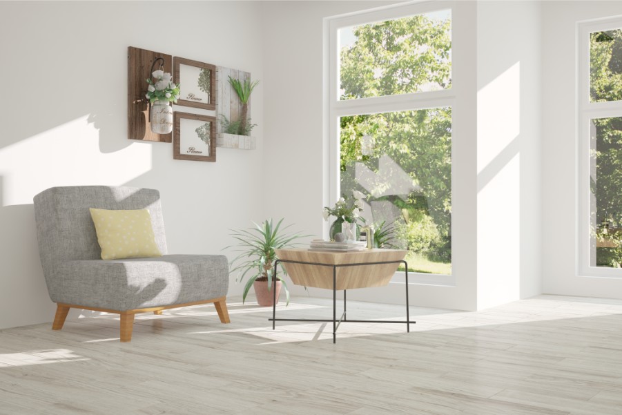
We’re dubbing this cozy corner the ‘book tower.’ Stack books on the floor near your favorite reading lamp and let your collection become part of the design—adding texture, height, and personality to the space. In a space like this, keep walls a clean white or light gray to maintain brightness and let the books become the main color source in the room.

A subtle gray like Sherwin-Williams Repose Gray can enhance natural light while complementing colorful spines and cozy textiles.

Work with Professionals You Can Trust!

Whether you’re working with a dedicated study or converting a corner into a cozy reading retreat, choosing the right home library colors sets the tone for the whole space. From traditional library paint colors to fresh modern takes, these ideas can help you define the best color for your library based on light, layout, and style.

Ready to update your home library wall colors? Get a free quote today for your paint project from the Paintzen team to bring your color vision to life—quickly and confidently. Whether you’re looking for the best colors for library walls or a fresh new vibe for your reading nook, Paintzen is here to help.

Get A Quote For Your Paint Project

Frequently Asked Questions About Library Paint Colors

What are the best paint colors for a home library?

Rich, saturated colors like navy, forest green, and charcoal create a warm, intimate setting perfect for reading. Light neutrals like off-white or soft gray work well for minimalist or multipurpose spaces.

How do dark colors affect a home library’s ambiance?

Dark colors can make a library feel cozier, more enclosed, and serene. They help reduce visual distractions and focus the eye on books and furnishings. When paired with the right lighting, dark tones can elevate the room’s sophistication.

Can light colors work in a home library?

Yes! Light colors create an airy and open feeling and are ideal for smaller libraries or rooms with limited natural light. Pair with warm wood tones and textured accessories to prevent the space from feeling too stark.

What is the best color for library walls if I want a timeless look?

Colors like deep green, muted navy, and classic beige are timeless choices for libraries. They pair well with traditional wood furniture and book-lined walls while staying stylish over time.

Should I paint my bookshelves the same color as the walls?

Painting bookshelves the same color as the walls can create a seamless, built-in look. It also visually simplifies the room, making it feel larger and more unified. Use this trick in small or narrow spaces for maximum impact.

Get A Quote For Your Paint Project