
With remote work now a permanent part of many people’s lives, video calls have become a regular fixture of the modern workday. While virtual backgrounds can be fun, nothing beats a polished, professional space that looks great on camera. A fresh coat of paint is one of the easiest ways to upgrade your backdrop. Let’s explore the best paint colors to use as a background for video conferencing.
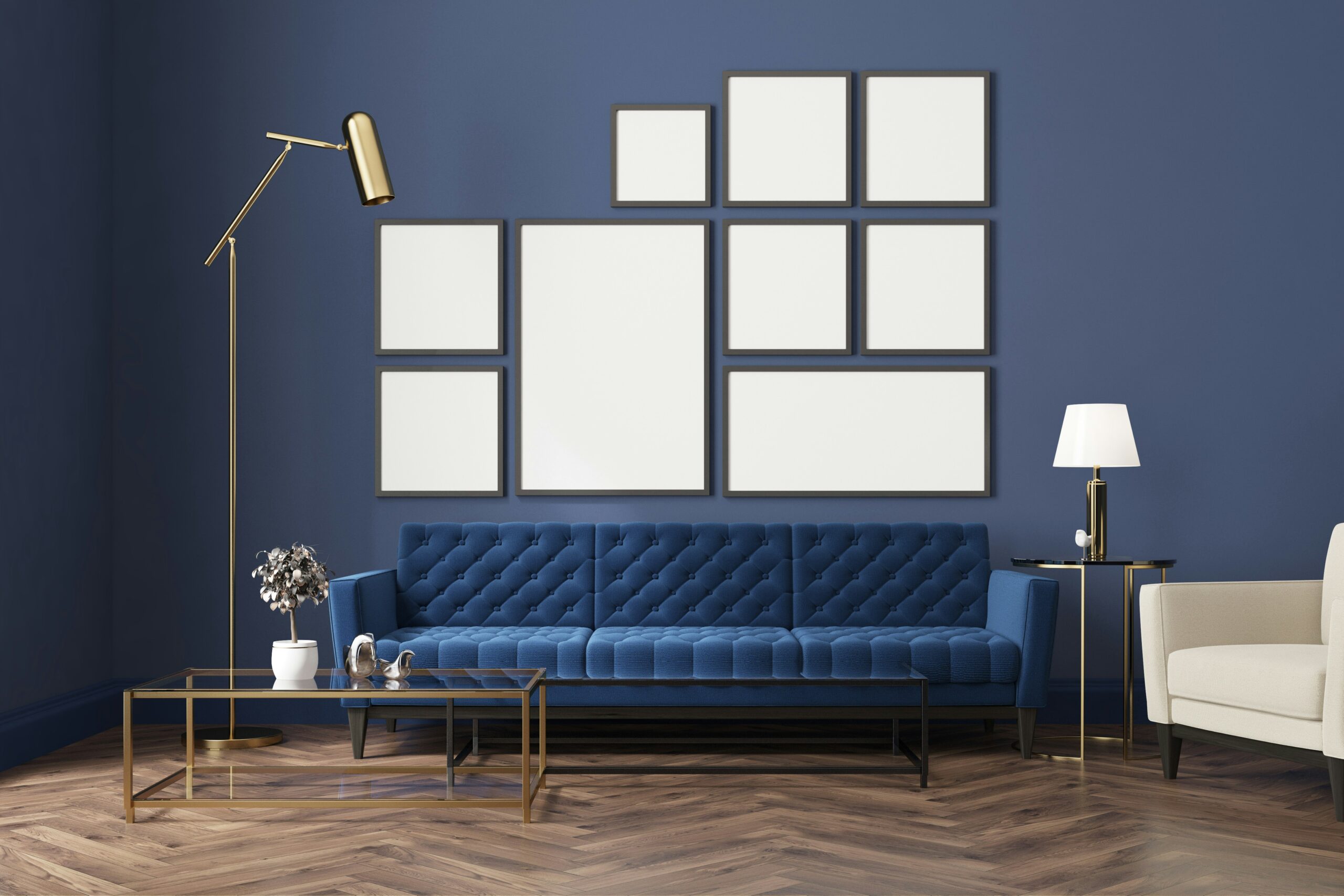
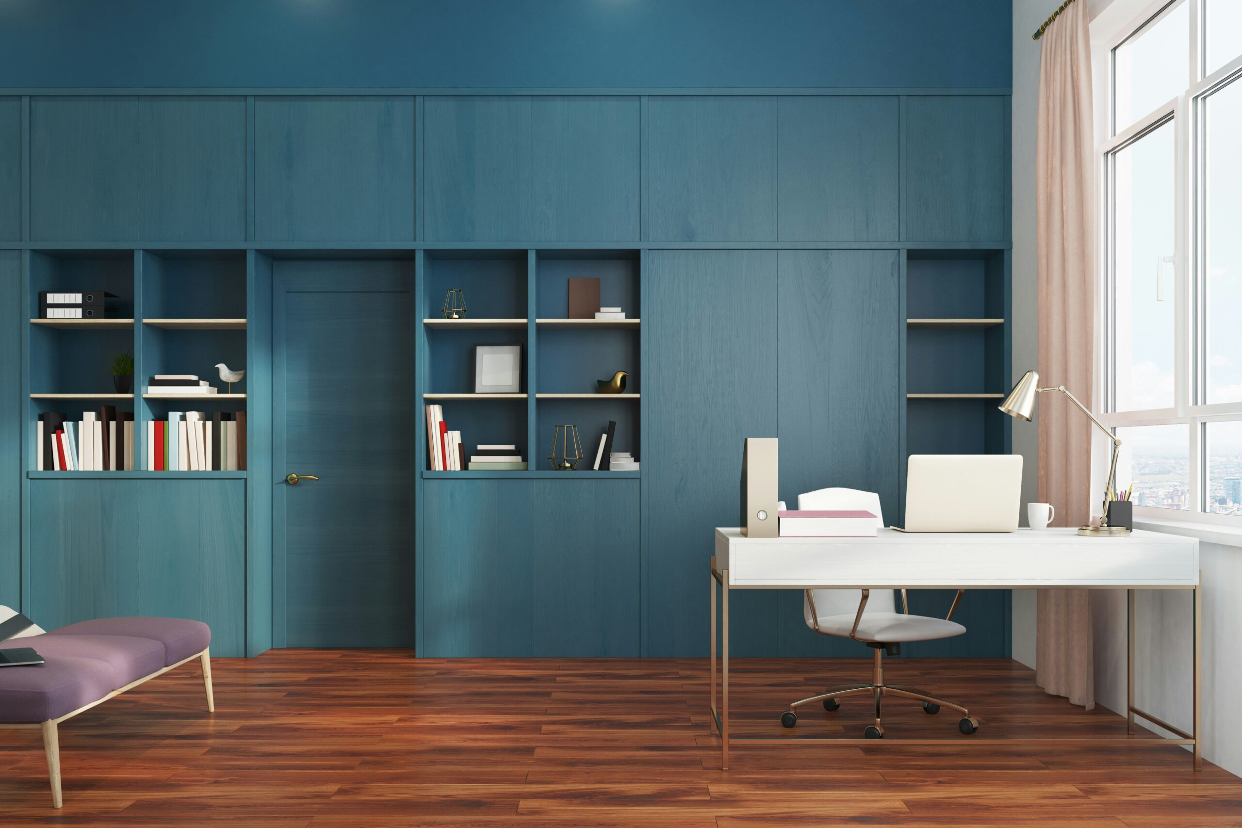
Naval
Shop Sherwin-Williams Naval
Looking for an instant classic? Try Naval. This new neutral is both refreshing and adaptable. It helps you stay focused and increases productivity, but it also looks crisp and professional on camera. Pair it with light gold and white for maximum effect.
Sea Salt
Shop Sherwin-Williams Sea Salt
Sea Salt is a light, pure, tropical aqua, perfect with silver or white accents. This soothing color helps you work more efficiently but also keeps you calm and centered. And turquoise tends to look good with every skin tone and hair color, making it a flattering backdrop for your video calls.
Repose Gray
Shop Sherwin-Williams Repose Gray
Repose Gray, a mid-tone, cool gray, is ready for its closeup. This hue will give your room a timeless, elegant look, plus its calming effect will help you stay focused on the task at hand. For fans of Mid-Century Modern, this color pairs beautifully with lemony yellow, a combo that would rock on camera.
Pink Ground
Shop Sherwin-Williams Pink Ground
Millennial Pink, aka delicate or blush pink, burst onto the scene in 2016, and its popularity has only grown. Put it to work for you, especially a warm-toned one like Pink Ground, and you’ll improve focus, boost creativity, and promote concentration. This makes Pink Ground perfect for a home office.
Liveable Green
Shop Sherwin-Williams Liveable Green
Green is energizing, but it can also be calming, making it a good color if you work on deadlines. If that sounds like you, give Liveable Green a try. With minimal accents in neutral, brass, or silver, it will look uncluttered and clean.
Creamy
Shop Sherwin-Williams Creamy
For north-facing rooms (or any room with cool light), try painting the walls warm white like Creamy. It keeps the space from looking sterile, like an all-white color might. And it looks great on camera, especially when paired with deeper wood tones or even white shiplap.
Tips for Lighting Your Video Background
Any color can be tricky to light well for the camera, though. Before you dial in, experiment until you get the blend of natural and artificial light just right. Try setting up your desk to face a window to take advantage of soft, natural lighting during the day, and supplement with a ring light or diffused desk lamp in the evening. Avoid overhead lighting that casts shadows or creates glare, and always test your lighting setup on camera before a big meeting. With the right combination, you and your background color will look polished and professional. Consider investing in LED lights with adjustable color temperature to match your wall hue and time of day. Small tweaks in lighting can significantly enhance the visual clarity and warmth of your video presence.
More Conference Room Color Ideas
Are you looking for more color ideas? Explore the latest Sherwin-Williams color palettes. These thoughtfully curated hues encourage well-being and authenticity and even lift our moods. Colors like Misty, Cavern Clay, and Aloof Gray would also be great backdrops for video conferences. For shared spaces like meeting rooms or executive offices, consider paint colors that foster concentration and collaboration while remaining neutral enough for different work styles and personalities. The right palette can influence how people engage on screen and in person. Think about layering complementary accent walls or incorporating brand colors subtly to keep things dynamic but still professional.
Choosing a Background Color Based on Skin Tone
Not all colors complement every complexion equally. When selecting the best wall color for your video background, take your skin tone into consideration. Warm skin tones tend to look best against earthier hues like olive green, beige, or warm terracotta. Cool undertones are flattered by grays, blues, and soft lavenders. Neutral tones often shine against mid-tone neutrals and creamy whites. If you’re unsure, try a quick camera test with paint swatches before committing. The right background color can enhance your natural coloring and help you appear more vibrant and alert on screen.
Best Paint Finishes for On-Camera Walls
Paint finish plays a key role in how your background looks on video. While glossy finishes reflect too much light and can create glare or unwanted shine, matte or eggshell finishes absorb light more evenly and reduce distractions. Satin finishes are a good middle ground if you want a touch of luster without reflection. The goal is to provide a clean, professional backdrop that doesn’t cause lighting issues or emphasize wall imperfections. Choose a finish that pairs well with your lighting setup and helps your chosen paint color look rich and even under camera lights.
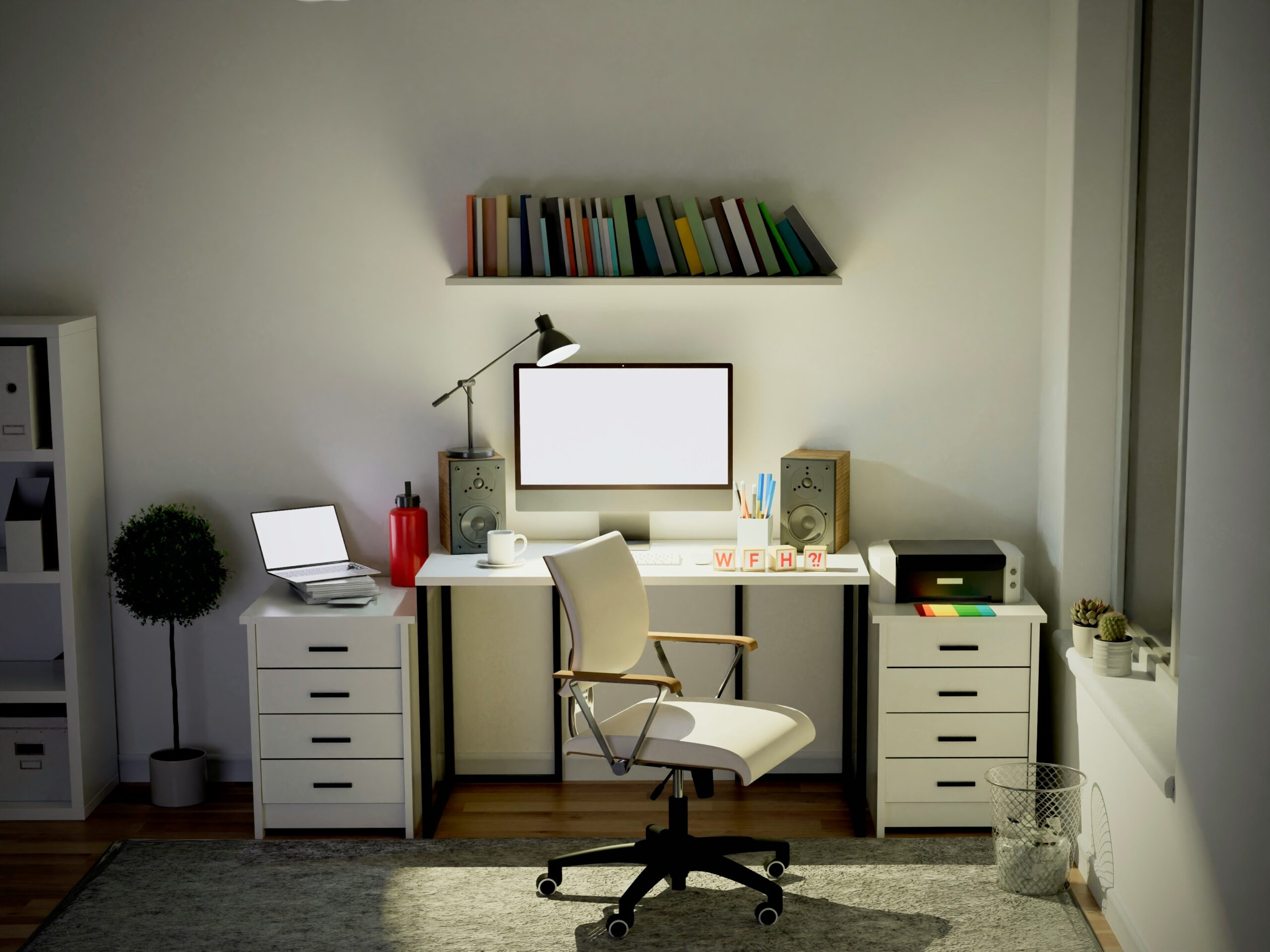
How to Create Depth with Color and Décor
A single-colored wall can sometimes feel flat or dull on screen. To create a sense of depth and dimension in your video conference background, pair your paint color with subtle decor elements. Floating shelves, framed artwork, greenery, and books can break up the space and add visual interest. For example, a navy wall paired with brass-framed prints or a sage green wall complemented by wooden planters can create a warm, layered effect. The trick is to balance personality with professionalism—your space should reflect your style without pulling focus from your face during meetings.
Explore More Paint Ideas for Zoom Calls
Whether you’re designing a dedicated home office or updating a conference room, the right wall color can make a big difference in your video presence. The best background color for Zoom is one that flatters your lighting setup, your wardrobe, and your skin tone. If you’re unsure what background color is best for video, look for calming blues, muted greens, or warm neutrals. These options offer professional, non-distracting video background colors for any setting.
FAQs About Video Background Wall Colors
What is the best background color for video conferencing?
The best background color for video conferencing is one that minimizes distraction, flatters your appearance, and reflects light evenly. Muted blues, soft greens, and warm neutrals are excellent choices because they strike a balance between professionalism and comfort. Colors like Sherwin-Williams Repose Gray or Sea Salt work well under various lighting conditions and camera settings.
How do I choose the right paint color for my Zoom background?
To choose the right paint color for your Zoom background, consider your skin tone, lighting setup, and the mood you want to convey. Cool-toned individuals often look great against blues and grays, while warm-toned individuals benefit from earthy or beige hues. Do a test video call with color swatches taped to the wall to see how each shade appears on screen.
What paint finish works best on camera?
A matte or eggshell paint finish is typically best for video backgrounds. These finishes reduce glare and provide a smooth, soft look on camera. Glossy and semi-gloss finishes can reflect too much light and show imperfections, making them less ideal for a clean video presentation.
Are bright colors a good choice for video call backgrounds?
Bright colors are generally not recommended as video call backgrounds. While they can be energizing, they often overpower the screen and can be harsh on the eyes during extended meetings. Instead, choose toned-down, balanced hues that offer visual interest without distraction.
Can lighting affect how my wall color looks on Zoom?
Yes, lighting plays a huge role in how your wall color appears on camera. Natural light, LED desk lamps, and ring lights all interact with paint colors differently. A color that looks perfect in daylight may appear dull or distorted under artificial light. Test your lighting setup at different times of day to ensure your wall color remains flattering and consistent.
Final Thoughts on Choosing the Best Video Conferencing Background
The best background for video conferencing is one that supports your work style, enhances your appearance on camera, and creates a clean, organized impression. From soft neutrals to bold but balanced hues, there are plenty of wall colors that function well as backdrops for video calls. If you’re updating your space for virtual meetings, consider these shades not just for their aesthetic appeal but for how they reflect light and color through your webcam.
Learn More About Designing the Perfect Video Background
Get expert help choosing the right paint for your home office or meeting space. Schedule a consultation with Paintzen today.