You’re likely familiar with the primary colors and maybe even secondary colors. However, have you heard of tertiary colors? Tertiary colors blend primary and secondary colors, and add the color layers your home needs to feel designed, exciting and collected. If your home’s color scheme is feeling flat, read on to learn more about tertiary colors and how to use them in your home.
Understanding the Color Wheel
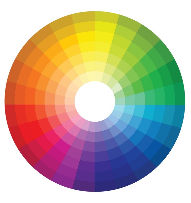
To fully understand what tertiary colors are, it’s essential to have a full picture of the color wheel. Below are the different color types included on the color wheel.
Primary colors
The three primary colors set the foundation for various custom colors.
- Red
- Yellow
- Blue
Secondary colors
The three secondary colors are a blend of three primary colors. These colors are:
- Orange
- Green
- Purple
Tertiary colors
How many tertiary colors are there? There are six tertiary colors. The tertiary colors definition in art is colors are made by mixing one primary color and one secondary color. These tertiary colors are:
- Yellow-orange
- Red-orange
- Red-purple
- Blue-purple
- Blue-green
- Yellow-green
Tertiary colors are often used as complementary colors to accent and make the main color stand out. However, tertiary colors can also take center stage. What are the tertiary colors? Below goes into greater detail about tertiary color examples.
Red-Orange

A warm shade of red-orange, such as PPG’s Clay Pot, works beautifully with a shade of a secondary color, such as a mossy green. Painting a dining room a rich, warm shade of red-orange invites you to settle in and enjoy a leisurely meal with family and friends. According to color psychology, red-orange may also stimulate the appetite. Chair cushions or curtains in a soft shade of mossy green can soften the space and add additional depth.
Red-Purple
A shade of glossy fuchsia is an eye-catching hue to use in a smaller space such as a library or a powder look. It’s a bold color that makes a significant impact in a more intimate area. A shade such as PPG’s Wild Plum can help you achieve this look. Red-purple walls are beautifully complemented by window treatments or furniture in lime green or mint shades.
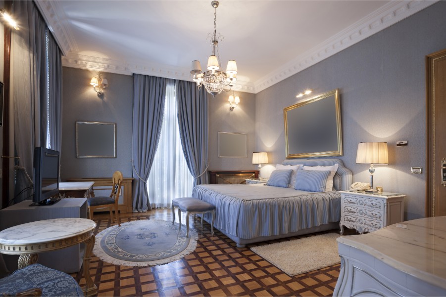
Blue-Green

A watery blue-green like PPG’s Aqua Blue is a perfect hue for a bedroom. It can evoke soothing feelings of calmness and help you wind down after a long day. Shades of white, cream, tan, such as white bedding, rattan furniture, or cream window treatments, can add a level of peace and serenity to the space.
Yellow-Orange

A shade of yellow-orange in a kitchen is a bright, sunny hue that can feel welcoming and put you at ease. It’s an excellent choice for a kitchen, which is often a gathering spot for family and friends. It works exceptionally well in rooms that receive plenty of natural sunlight. Shades of creams and tans used in the rug, window treatments, or furniture can help balance the space.
Blue-Purple
Using a rich shade of blue-purple in a living room can create a dramatic yet cozy feeling. It’s a shade that makes a bold impact and can create an impressive space. Complementing blue-purple with teal, pale pink shades or grounding neutrals in the furniture, window treatments, or accent pieces can help round out the space.
Yellow-Green
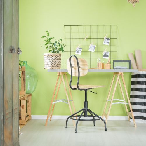
Using yellow-green in a primary gathering spot, such as a family room or kitchen, can serve as a mood-lifter. It’s a bright, sunny shade that can elevate the overall feeling in the space. It pairs well with deeper shades of green and blue, which can add an element of relaxation to yellow-green’s energizing tone. A yellow-green room with green and blue window treatments or accents can create an overall visually cohesive space.
Getting Started
When you’re thinking of a new color scheme, ask yourself how each color makes you feel. If you get stuck, Paintzen is here to help you choose your color. Paintzen can send you free samples of tertiary colors. Pay attention to how each color makes you feel and envision the room where the paint colors would work best. Then, fill out a free and instant online quote for your project, and Paintzen interior painters can be ready to paint your space in as soon as one week.