You walk into a room and feel instantly relaxed. Another space makes you feel energized, ready to take on the day. And yet another helps you focus and concentrate. You may not always notice it consciously, but chances are, the paint color on the walls is playing a big role.
Our environments affect us in subtle and powerful ways. And color is one of the most influential aspects of any space. In fact, studies in color psychology suggest that the shades around us can alter our emotional states, impact our productivity, and even affect how we sleep.
So how do you harness the power of paint to create rooms that support how you want to feel? Let’s explore how color affects mood and how to design your home with intention—using paint as a powerful, invisible hand that guides how you feel in every room.
The Science Behind Color Psychology
Color psychology is the study of how colors affect human behavior. While responses to color can be subjective, there are consistent patterns in how certain hues tend to influence mood and perception. For example, blues are generally calming, reds are stimulating, and yellows are associated with happiness.
Scientists have found that exposure to certain colors can affect our heart rate, blood pressure, and even cortisol levels. In marketing, color is used to trigger specific consumer behaviors. In healthcare, color is used to calm patients. And at home, you can use these same principles to shape how you feel, rest, work, and interact in your personal spaces.
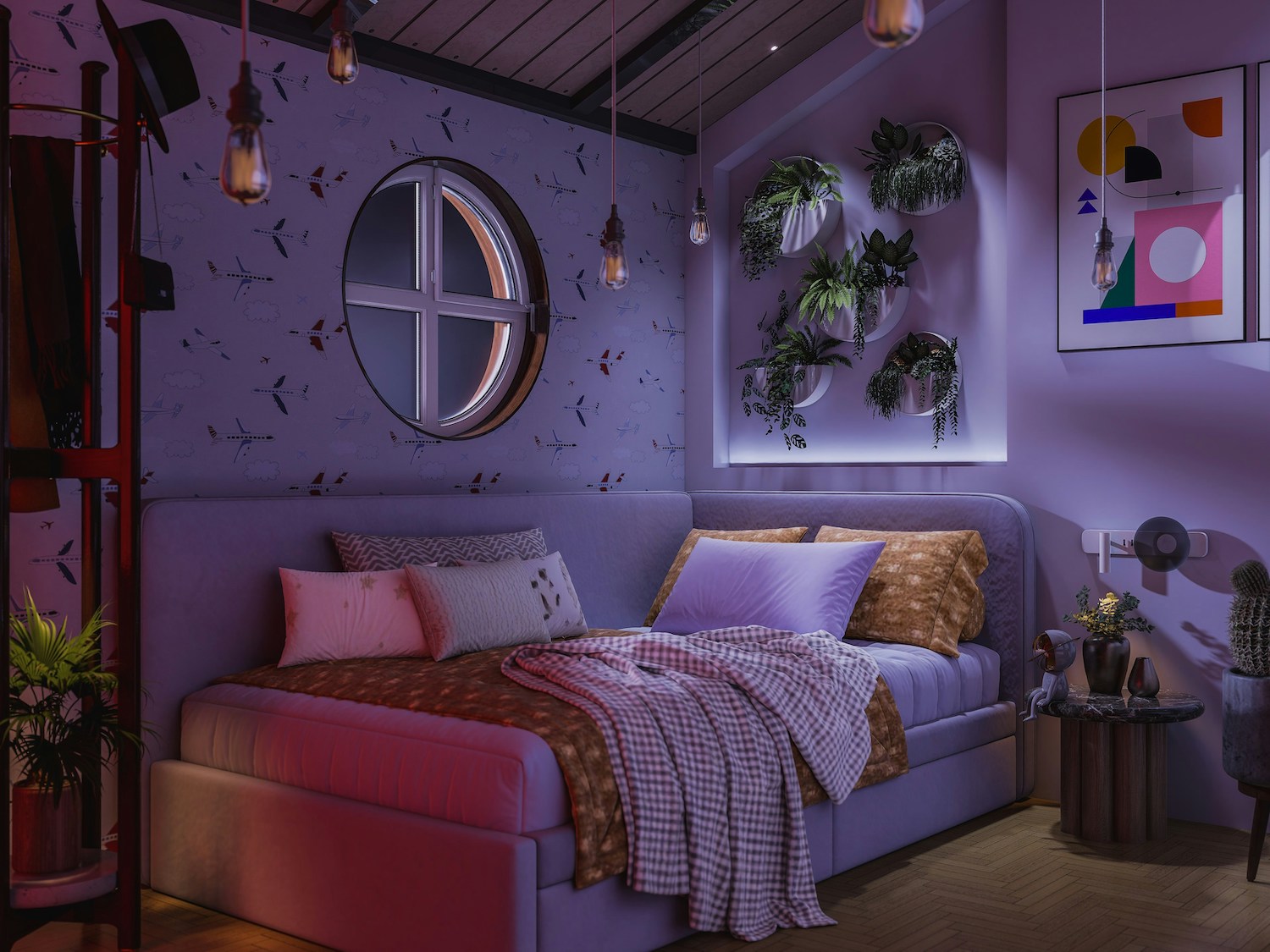
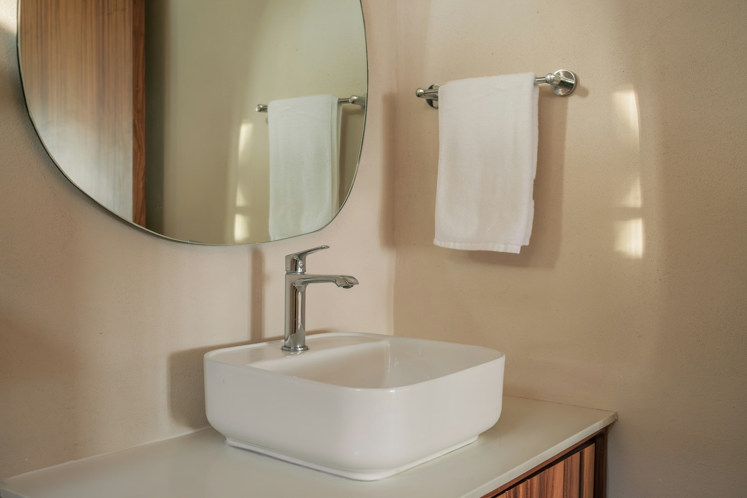
Calming Spaces: Painting for Relaxation
In a fast-paced world, many people crave a home that offers a sense of calm. That’s where color can do some heavy lifting.
Best Calming Paint Colors:
- Soft blues and greens: Evoking the sky and sea, these colors naturally relax the mind and body.
- Lavenders and light purples: These hues offer a gentle, tranquil feel without feeling cold.
- Warm neutrals: Off-whites, taupes, and soft grays can create a soothing backdrop that doesn’t overwhelm.
Where to Use Calming Colors:
- Bedrooms: These are top choices for sleep sanctuaries.
- Bathrooms: Transform your bath into a spa-like retreat.
- Reading nooks and quiet corners: Help your mind wind down with a peaceful palette.
Design Tip: Pair calming colors with soft textures and natural materials—like linen, rattan, and wood—for an even more grounding effect.
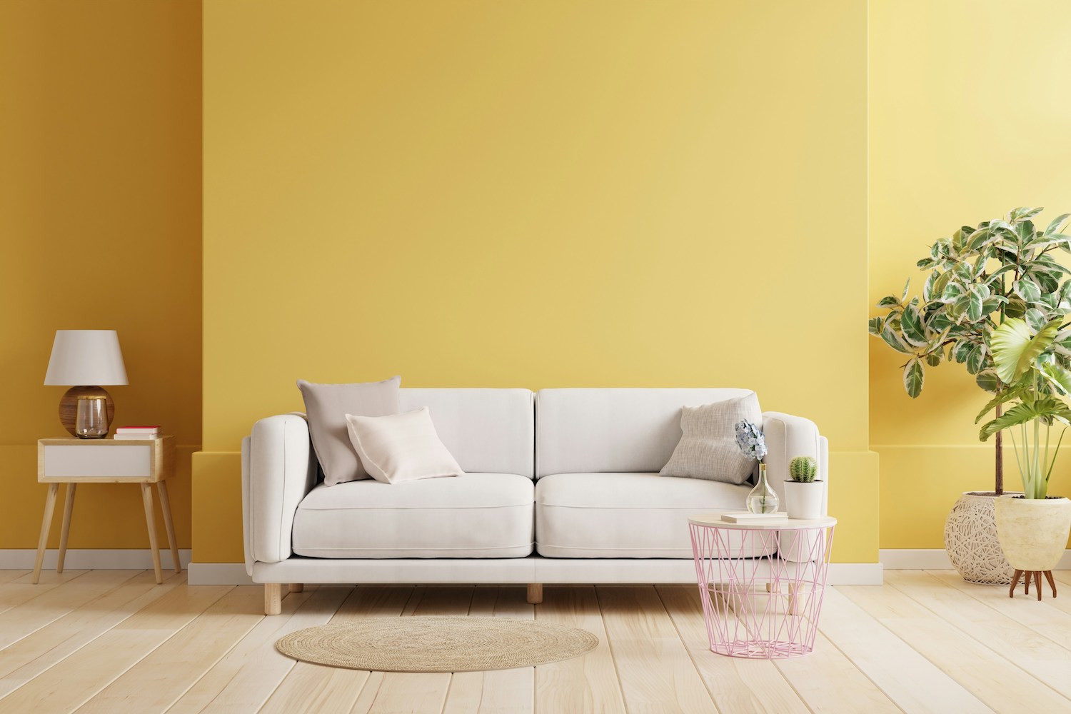
Energizing Spaces: Painting for Activity and Creativity
When you want a room to inspire movement, conversation, or creativity, color can spark that energy.
Best Energizing Paint Colors:
- Yellows and oranges: These warm, bright hues stimulate the brain and evoke feelings of optimism.
- Bold reds: Use sparingly, as red is highly stimulating and can raise your heart rate.
- Vibrant corals or tangerines: Fun, friendly colors that encourage social interaction.
Where to Use Energizing Colors:
- Kitchens: Great for gathering, cooking, and conversation.
- Home gyms or workout spaces: Motivating colors can help you push through that last set.
- Playrooms or creative studios: Boost imagination and creative thinking.
Design Tip: Balance vibrant walls with neutral or cool accents to prevent the space from feeling overwhelming.

Focused Spaces: Painting for Productivity and Concentration
Working from home? Studying for a big exam? The right color can help you lock in.
Best Paint Colors for Focus and Productivity:
- Cool greens: Associated with balance and calm, ideal for long periods of focus.
- Muted blues: These help with mental clarity and are commonly used in offices.
- Charcoal or slate grays: Serious, grounding colors that support concentration.
Where to Use Focus Colors:
- Home offices: Especially if you’re staring at a screen all day.
- Study areas for kids or teens: Helps maintain attention.
- Task-oriented rooms like laundry or craft areas.
Design Tip: Keep the lighting in mind. Natural light can brighten up a darker focus color, while artificial light might make it feel too heavy.

Personalizing Your Palette: Know Yourself and Your Goals
While color psychology offers helpful guidelines, it’s important to recognize that personal preferences and cultural associations also play a role. What feels calming to one person might feel cold or uninspiring to another. Your past experiences, personality, and even your skin tone can affect how you react to different colors.
Ask yourself:
- How do I want to feel in this room?
- What activities will happen here?
- How much natural light does the space get?
- What colors do I naturally gravitate toward in clothing or decor?
Using your answers as a guide, you can make more intuitive decisions while still drawing on proven principles.

Color Pairing: Enhancing Mood with Combinations
No room exists in a vacuum. Paint colors often look best when paired strategically with other hues in the space.
For example:
- Blue and white can feel crisp, nautical, and calming.
- Gray and yellow offer a smart balance of focus and cheer.
- Green and beige feel earthy and grounded.
Use the 60-30-10 rule when planning color combinations:
- 60% dominant color (walls)
- 30% secondary color (furniture/upholstery)
- 10% accent color (art, pillows, decor)
This simple rule helps achieve harmony while still allowing for visual interest.
Don’t Forget the Finish: Matte, Satin, or Gloss?
The finish of your paint impacts not just how the color looks but how the room feels. A glossy red will feel very different than a velvety matte red.
- Matte/flat: Great for calming, soft environments.
- Eggshell/satin: Versatile and easy to clean—ideal for living rooms and bedrooms.
- Semi-gloss or gloss: Reflective and energetic, better for kitchens and bathrooms.
Choose a finish that complements the mood you want and the practical needs of the space.
Final Thoughts: Painting with Purpose
Color is more than just decoration—it’s communication. It speaks to your subconscious and shapes how you feel in a room. When you paint with purpose, every wall can support your goals, whether that’s deeper rest, sharper focus, or more joyful mornings.
At Paintzen, we believe in designing spaces that support your lifestyle. Our professional painting services can help you bring your vision to life—no stress, no mess. Let us help you choose the perfect palette and get the job done right.
Need help choosing the right color for your space? Book a free virtual consultation with one of Paintzen’s color experts and explore your options today.