What if the color of your walls could help you get more done, reduce stress, and stay focused through even the longest Zoom calls?
In the new era of remote work, your home office isn’t just a spare room—it’s your headquarters. Your productivity, creativity, and even your mood are shaped by the environment around you. And one of the most powerful tools in shaping that environment? Color.
We’ve long known that color influences human behavior. Marketers use it to inspire purchases. Hospitals use it to calm patients. And when it comes to your home office, you can use it to create a space that doesn’t just look good—but helps you work better.
Let’s take a deep dive into the psychology of color in home office design and how to choose the perfect palette for your work-from-home goals.
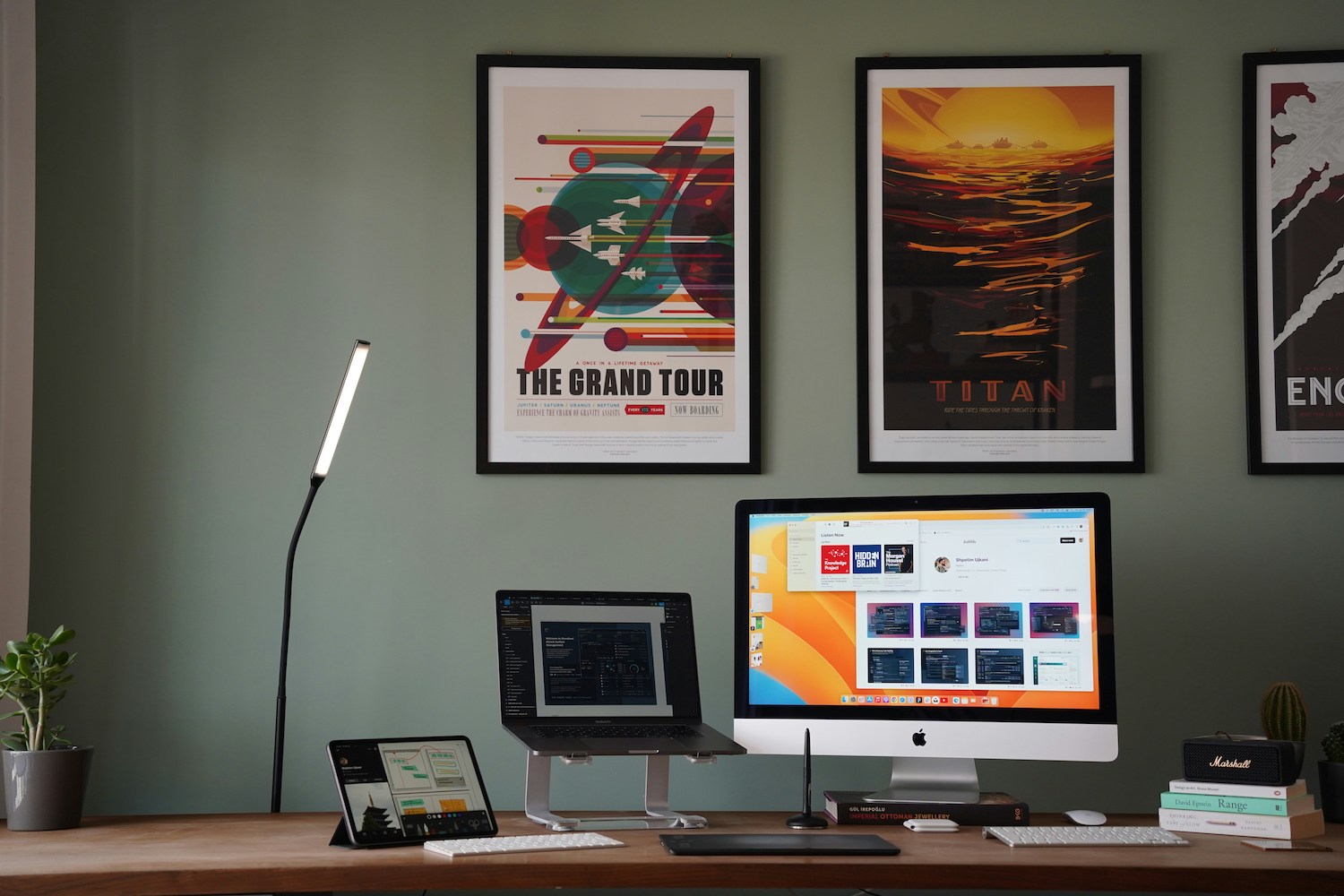
Why Color Matters in a Work Environment
Working from home presents unique challenges. Distractions are plentiful, boundaries are blurred, and motivation can waver without the structure of a traditional office. The right paint color can give you a psychological edge—helping you create a space that supports mental clarity, reduces fatigue, and enhances your ability to focus.
Color influences the brain’s neurotransmitters and can trigger emotional responses. Different hues evoke different states of mind:
- Blues tend to enhance focus and calm.
- Greens can boost creativity and reduce anxiety.
- Yellows may spark energy and optimism.
- Reds can increase alertness but also aggression or tension.
Understanding these subtle effects allows you to intentionally design your workspace around how you want to feel and perform.
Blue: The King of Focus
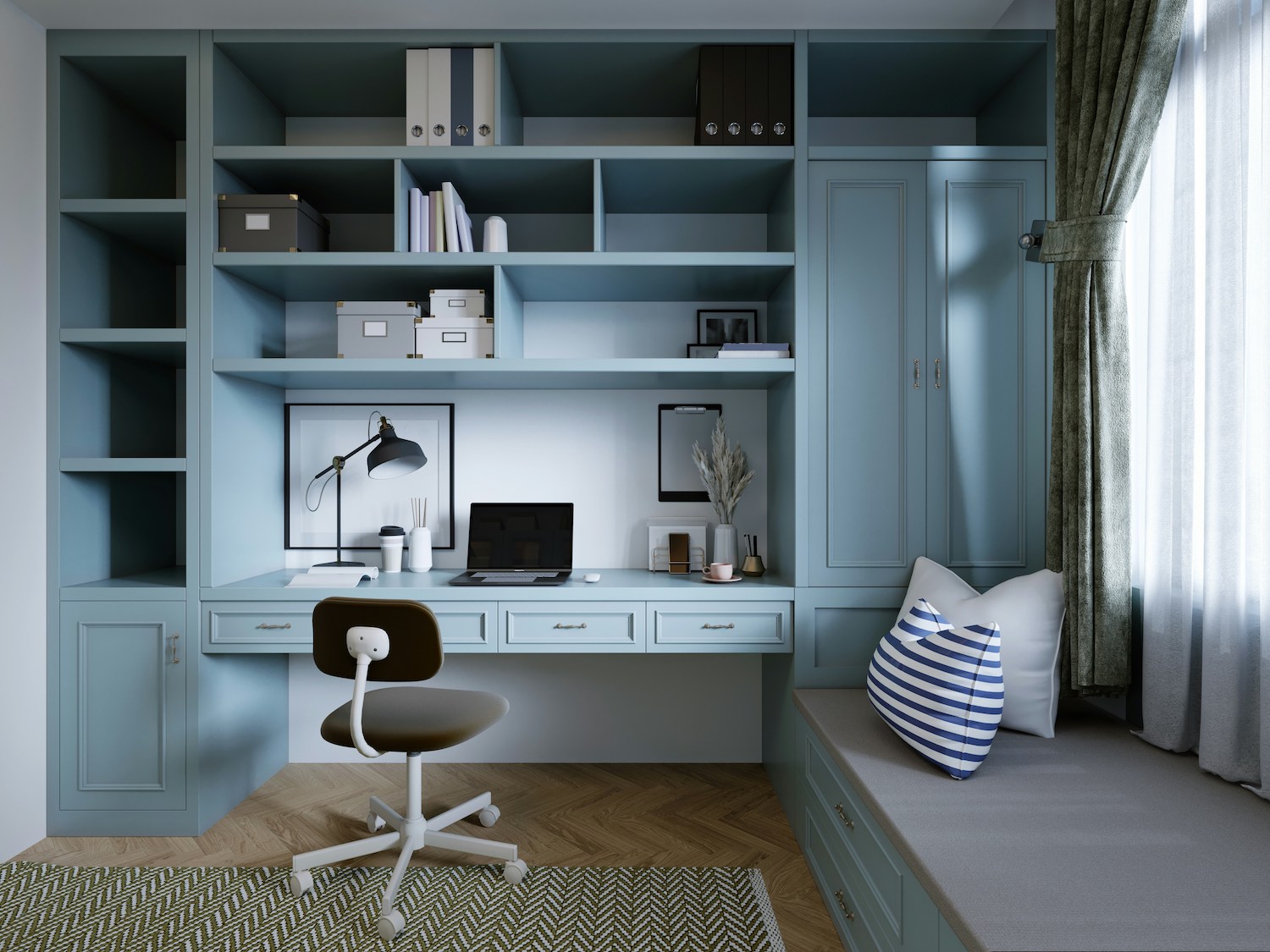
Blue is widely considered the best color for environments where sustained concentration is required. It slows the heart rate, reduces blood pressure, and promotes a sense of calm control—exactly what you need during tight deadlines or multitasking marathons.
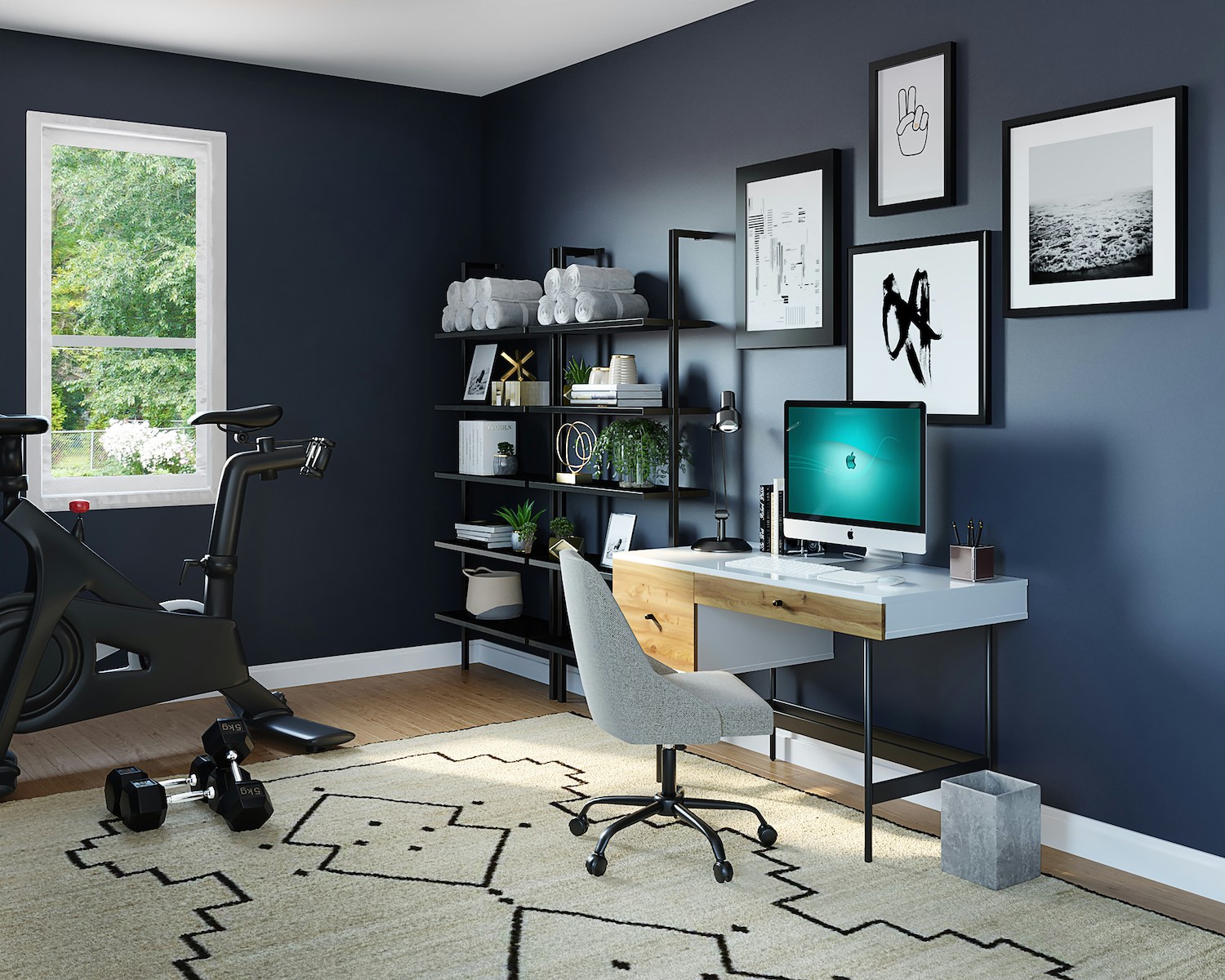
Lighter blues create a serene, open feel and are ideal for offices that double as a calm retreat. Deeper blues offer more gravitas and can give a home office a sophisticated, executive vibe.
Use blue if:
- Your work is detail-oriented.
- You’re in finance, tech, law, or academia.
- You want a sense of calm amid chaos.
Design tip: Soften a blue palette with warm wood furniture, brass accents, or art in complementary colors like coral or rust.
Green: Balance and Restoration
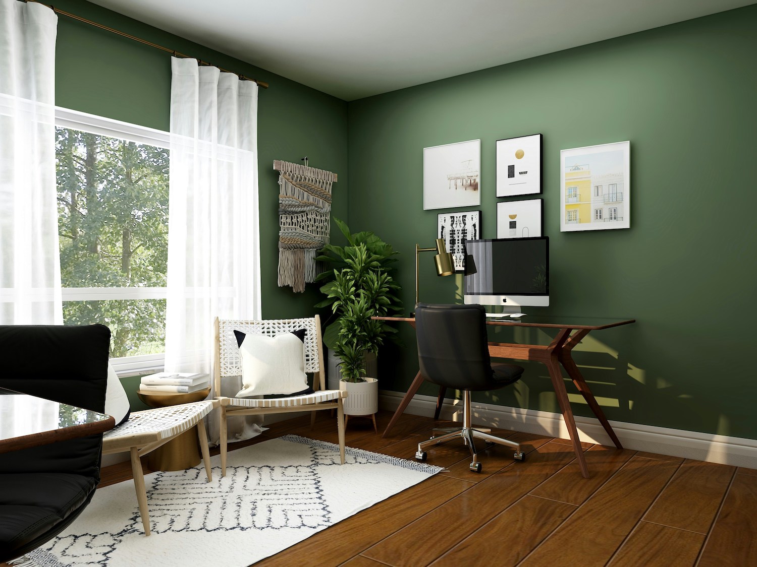
If your work involves long hours or high levels of stress, green is your ally. Associated with nature, green promotes balance and renewal. It’s easy on the eyes and reduces mental fatigue, making it ideal for jobs that require endurance.
Green also stimulates creativity, making it a favorite among designers, writers, and problem-solvers.
Use green if:
- You’re creative or work long hours.
- You want a space that feels refreshing and alive.
- You crave a nature-inspired work environment.
Design tip: Combine sage or olive green with natural elements like plants, stone, and textured fabrics to enhance its grounding effect.
Yellow: The Motivator
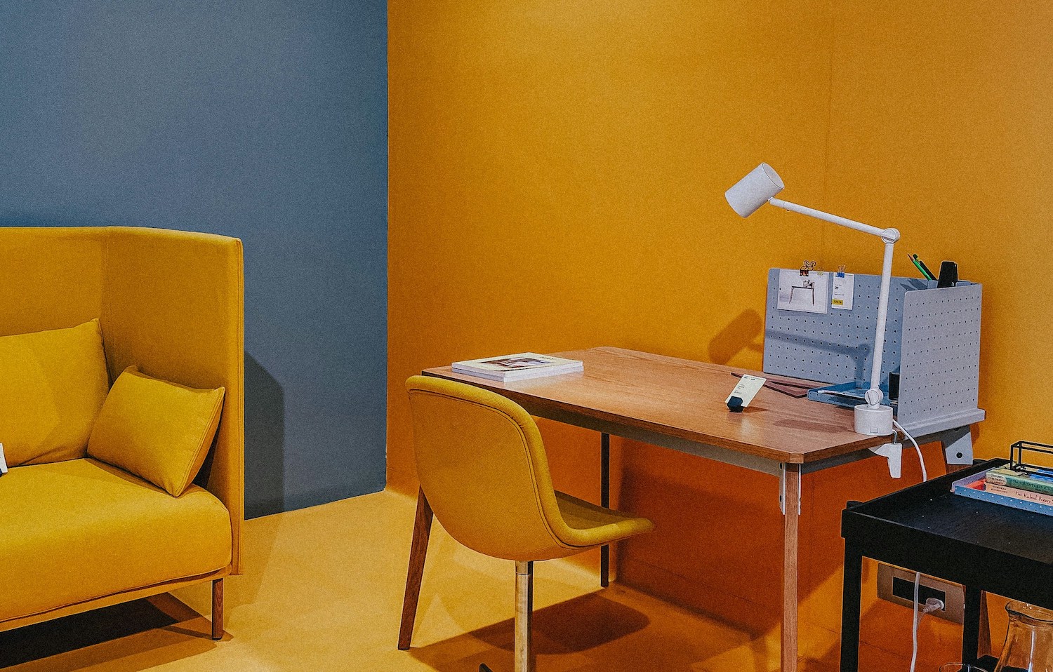
Yellow is energizing, cheerful, and associated with innovation and optimism. It’s a color that says, “Let’s get this done!”
But use with care. While soft yellows can lift your spirits, bright yellow can overstimulate and even cause anxiety in large doses.
Use yellow if:
- You need help staying upbeat and motivated.
- You work in a creative or startup environment.
- Your home office lacks natural light.
Design tip: Stick to muted or pastel yellows for walls, and add bright yellow through art, desk accessories, or accent chairs.
Gray: The Neutral Backbone
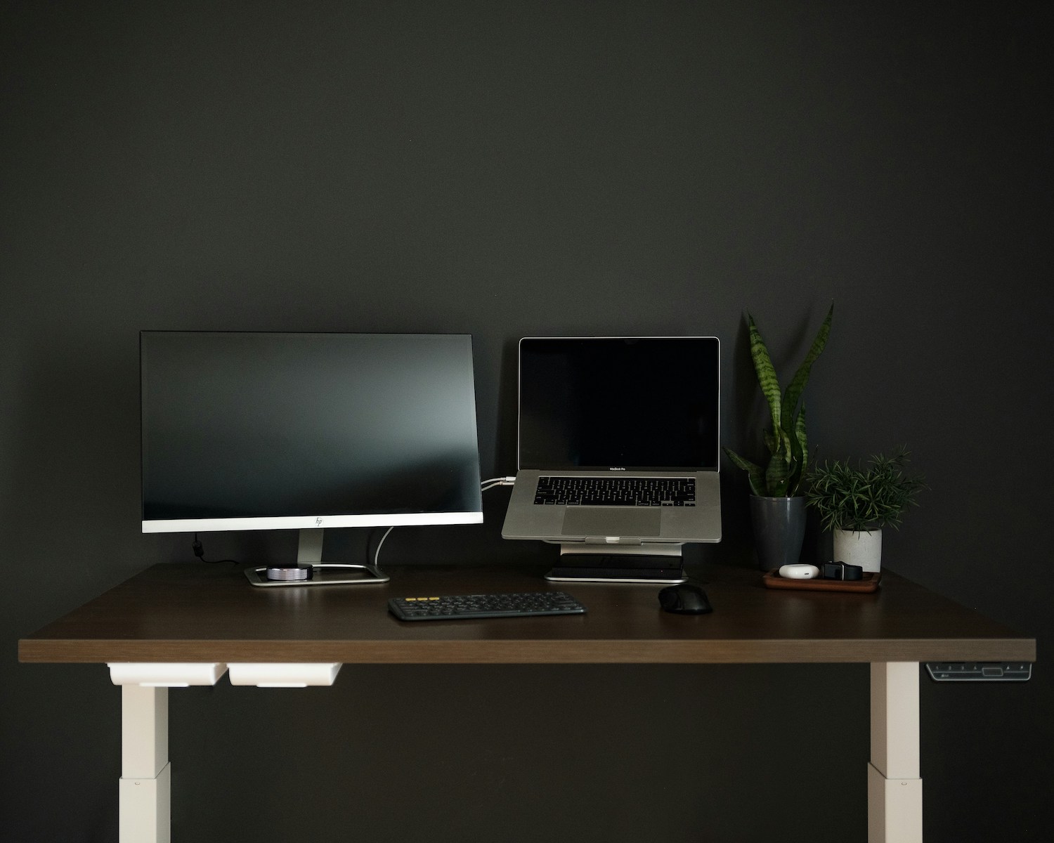
Gray is modern, versatile, and highly popular in office settings. It’s professional and non-distracting, creating a clean backdrop that allows your work to take center stage.
But be warned—too much gray can feel cold or uninspiring. To avoid the doldrums, layer in texture, color, and natural light.
Use gray if:
- You want a minimalist or industrial look.
- You’re easily distracted by color.
- You want flexibility to change decor frequently.
Design tip: Mix warm grays with white trim and use pops of color through accessories to keep things lively.
Earth Tones: Warmth and Comfort
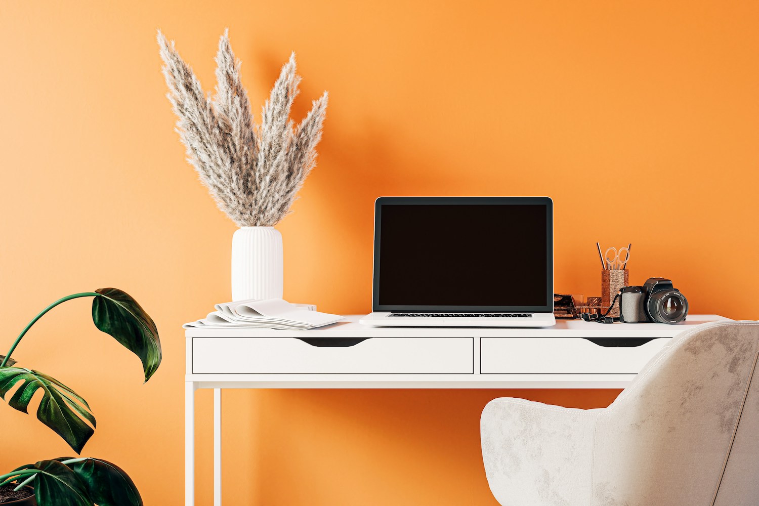
Rich earth tones like terracotta, ochre, rust, and taupe are gaining popularity in home office design. These colors offer a cozy, grounded feeling that can be comforting during long work sessions.
They also pair well with both modern and traditional furniture and can make your space feel more personal and less “corporate.”
Use earth tones if:
- You want your office to feel warm and inviting.
- You’re drawn to vintage or eclectic styles.
- You value comfort and personality in your space.
Design tip: Pair with warm lighting and layered textiles like rugs, curtains, or wall tapestries for an intimate vibe.

White and Off-White: Clean and Bright
A classic for a reason, white evokes clarity and cleanliness. It reflects light beautifully, making small or windowless spaces feel bigger and more open.
However, too much stark white can feel sterile. Off-whites and creams can soften the effect while still keeping things bright and fresh.
Use white if:
- You need a visual reset or blank canvas.
- You love a minimalist aesthetic.
- Your space gets lots of natural light.
Design tip: Add texture through furniture and materials—think a boucle chair, woven baskets, or a reclaimed wood desk.
Choosing the Right Color for Your Work Style
Your job, personality, and even your circadian rhythm all play a role in determining what colors will work best for you.
Ask yourself:
- Am I energized by bright, bold colors or soothed by cool, neutral ones?
- Do I need stimulation or calm to focus?
- What time of day do I do my best work?
- Do I work alone or host virtual meetings?
Also consider the lighting in your space. North-facing rooms tend to have cooler light and may benefit from warmer hues. South-facing rooms with ample sun can handle cooler or darker shades without feeling gloomy.
Color Zoning: A Trick for Multipurpose Offices
Many home offices serve multiple functions—workspace, guest room, storage area. You can use color zoning to define these areas visually.
For example:
- Paint the main workspace one color and the reading nook another.
- Use color blocking to separate a Zoom backdrop wall.
- Choose contrasting trim or accent walls to add visual structure.
Color can act like a psychological boundary, helping your brain switch gears as you move through tasks.
Finishing Touches: Trim, Ceiling, and More
Don’t forget the details. Your trim color, ceiling, and even your door can impact how the space feels.
- Ceilings: Light colors make rooms feel taller; a darker ceiling can feel cozy and grounded.
- Trim: White trim brightens a room; matching trim to wall color creates a seamless, modern look.
- Doors: Painted interior doors (navy, forest green, black) can make a bold statement and elevate the space.
Avoiding Common Color Mistakes
- Going too dark in a small or poorly lit space. It can feel claustrophobic.
- Choosing trendy colors that don’t suit your personality. What looks good on Instagram might feel wrong in your space.
- Ignoring how colors change in different lighting. Always test swatches!
Final Thoughts: Paint with Purpose
Designing a home office is about more than furniture—it’s about crafting an environment that fuels your goals. Color isn’t just decoration; it’s a tool for performance, wellness, and creative flow.
At Paintzen, we believe every wall should support your lifestyle. Whether you want a high-energy hub, a calm sanctuary, or a space that does both, our color consultants and expert painters are here to help.
Ready to design a home office that works as hard as you do? Let’s make it happen.
Book your free color consultation with Paintzen today and find the perfect palette to support your best work.