Midcentury modern paint colors span a rainbow from happy to earthy, depending on their placement on the timeline of the 1950s and ‘60s. After World War II, a housing boom brought what we think of as midcentury modern homes today – streamlined homes whose design put functionality before ornamentation. So, midcentury modern paint colors reflected the country’s post-war mood and were an important way to personalize a home.
These colors are still appealing to homeowners today, not just for their bright accents, but for the earthier hues that grounded them. For example, a home from that era might have a colorful bathroom tiled in powder pink, aqua or avocado green. Furniture ranged from bright red to subdued rust, from hot pink to quiet beige.
If you want to introduce midcentury modern paint colors to your home, you might consider one of these.
Midcentury Modern Paint Colors Superstar: Avocado Green

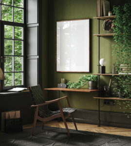
Green was one of the most prevalent colors of a midcentury modern color palette, particularly one that skewed toward avocado, like Vintage Vibe. This lush, subdued green would be perfect in a home office, creating a space where concentrating comes naturally.
Perennial Favorite: Powder Pink

Don’t limit Powder Pink to kids’ rooms – midcentury modern designers sure didn’t. One of the most popular bathroom colors of the era, this rosy hue was used for tile, fixtures and towels. Emulate that style by painting your on bathroom this cheery hue.
Wakeup Call: Sunny Orange

Midcentury modern paint colors reflected the country’s post-war optimism. Bold orange, like PPG’s Field Poppy, adorned everything from accessories to furniture. Paired with wood tones and neutrals, it gives any room a cheery pop of color.
Retro-Futuristic: Cosmic Blue

If you’re looking for a more subdued color in the midcentury palette, try a sapphire blue like Cosmic Dust. This hue showed up in swooping glass vases, chenille bedspreads and modern chairs. Try mixing it up in a living room, blending this with leaf green, warm gold and mid-toned wood.
Cars and Cardigans: Happy Aqua

When you think of midcentury modern colors, an aqua like Caribbean Crush may be one of the first to come to mind. From the Chevy Bel Air’s iconic aqua, chrome and white sedan to vinyl seats in soda shops, aqua rocked the era around the clock.
Warhol and Monroe: Dreamy Turquoise

If you’re looking for an authentic midcentury modern paint color, you can’t go wrong with dreamy turquoise like Carlisle. Whether you’re painting a living room wall or doing accents in a vintage kitchen, this hue will transport you back to a time when Andy Warhol memorialized Marilyn Monroe in a pop-art classic.
Atomic Red

When you think of midcentury red, think of a deep salmon hue like Wet Coral. This appeared on mod sofas and sectionals sunken into conversation pits. Now, you can use this color the walls, paired with earthy neutrals or crisp black and white for an authentic midcentury modern color palette.
Cinnamon Elegance: Restful Rust
One of the most popular earth tones of the era, rust was saved for ultra-sophisticated rooms, especially those with masculine overtones. Paired with dark wood tones and brass, a color like Glowing Firelight gives a room a soothing, natural vibe.
Want to adorn your home with midcentury modern paint colors? Our color consultants can help you pick the perfect palette – and our interior painting pros are ready to bring your design to life.